Serious research, without the intimidation.
Advisor Alpha gives individual investors fundamental equity research they can invest on with conviction. Their website was a dated, text-heavy portal that undersold the research. We redesigned and developed it in 15 days.
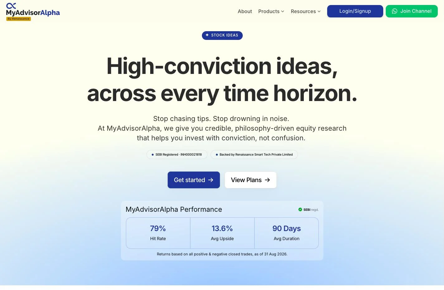
Timeless research. A website that looked dated.
Investing today is noisy: social media hype, volatile tickers, and apps designed to make people trade more. Advisor Alpha stands for the opposite, patient research grounded in a clear philosophy.
Their platform didn’t show it. It was a dated, text-heavy portal, and the quality of the research was lost in how it was presented. Three problems stood out.
Engagement gap. Deep-dive reports run past 20 pages and were hard to navigate on a phone.
Trust deficit. The look felt old-school rather than timeless, which made it harder to win younger, high-net-worth investors.
Discovery issue. Years of valuable research sat buried in a cluttered archive.
Four experiences, one calm system.
We designed around what an investor actually does on the site: find research, read it, decide, and trust the source. Then we built it so the Advisor Alpha team can run it themselves.
Research discovery & navigation
A structure that surfaces the right report, new or old, in a few taps.
Research reading experience
Long reports broken into a clean, scannable read that holds up on mobile.
Investor decision support
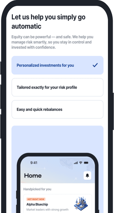
Information laid out to help investors act with conviction, not impulse.
Trust & credibility
A premium, timeless identity that matches the depth of the research.
A premium read, on every screen.
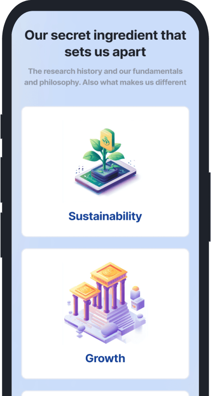
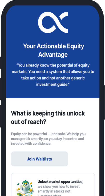
The brand’s identity, extended into a structured UI kit: a refined colour story and a strict type hierarchy that turn dense research into something investors want to read.
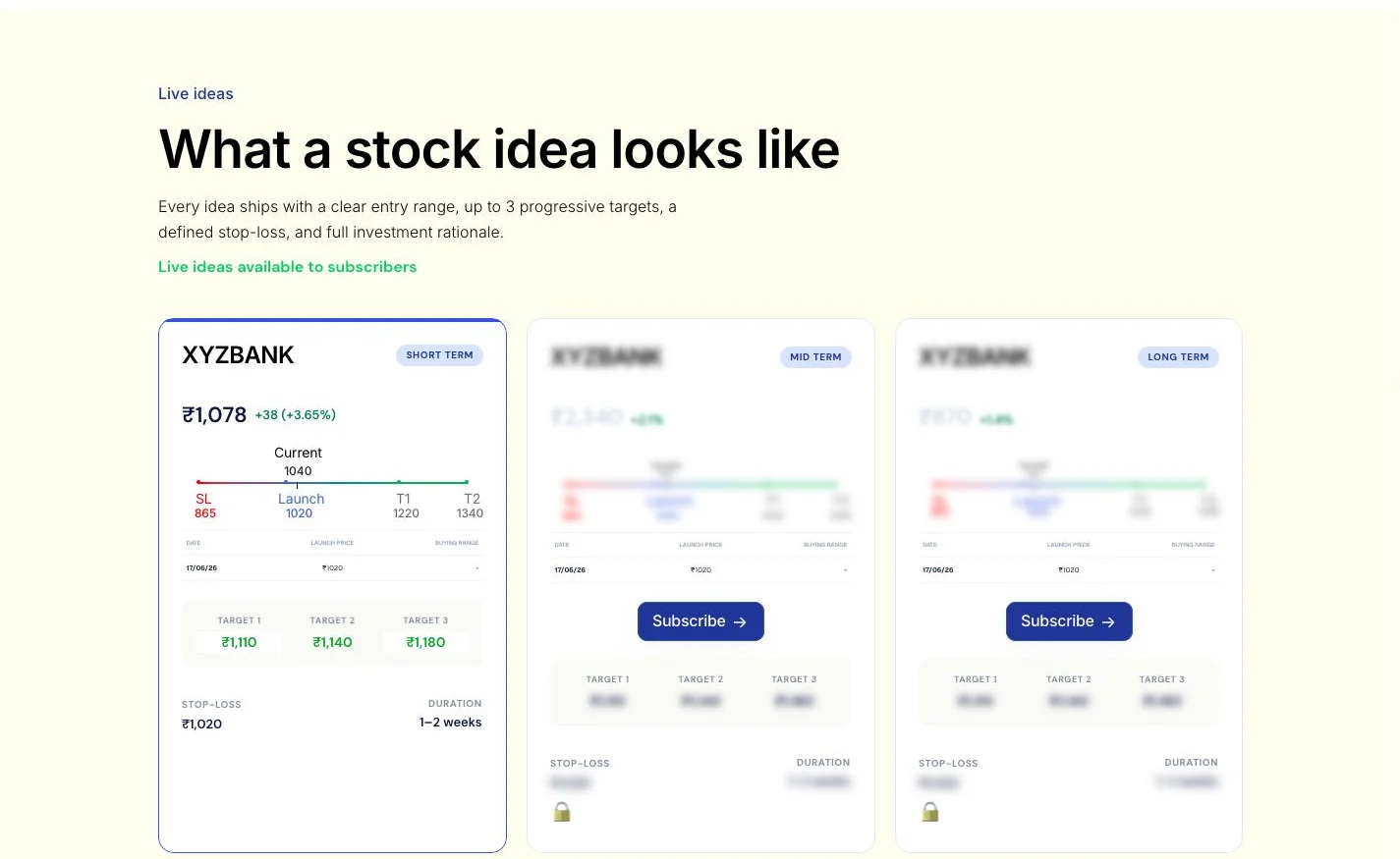
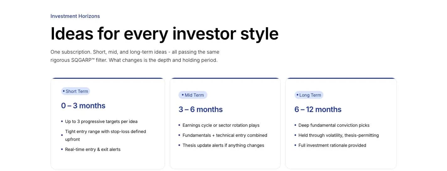
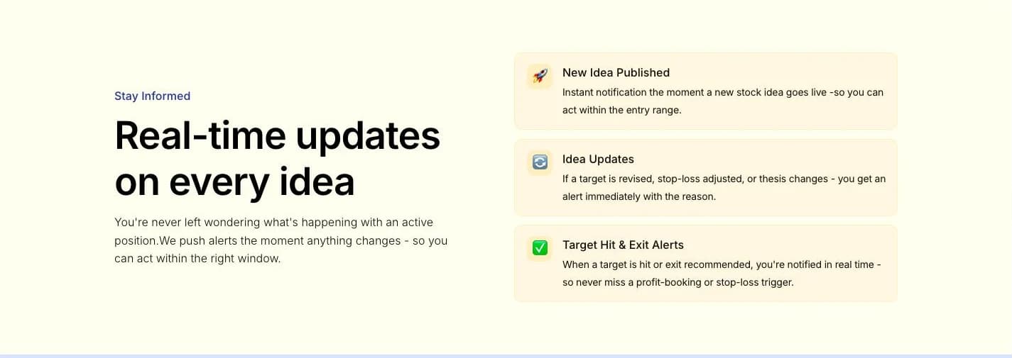
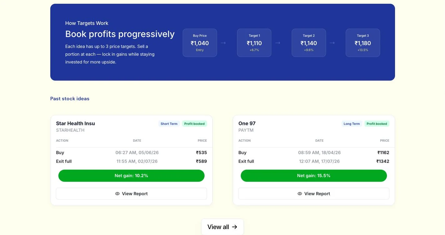
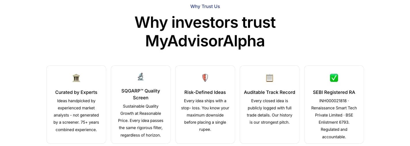
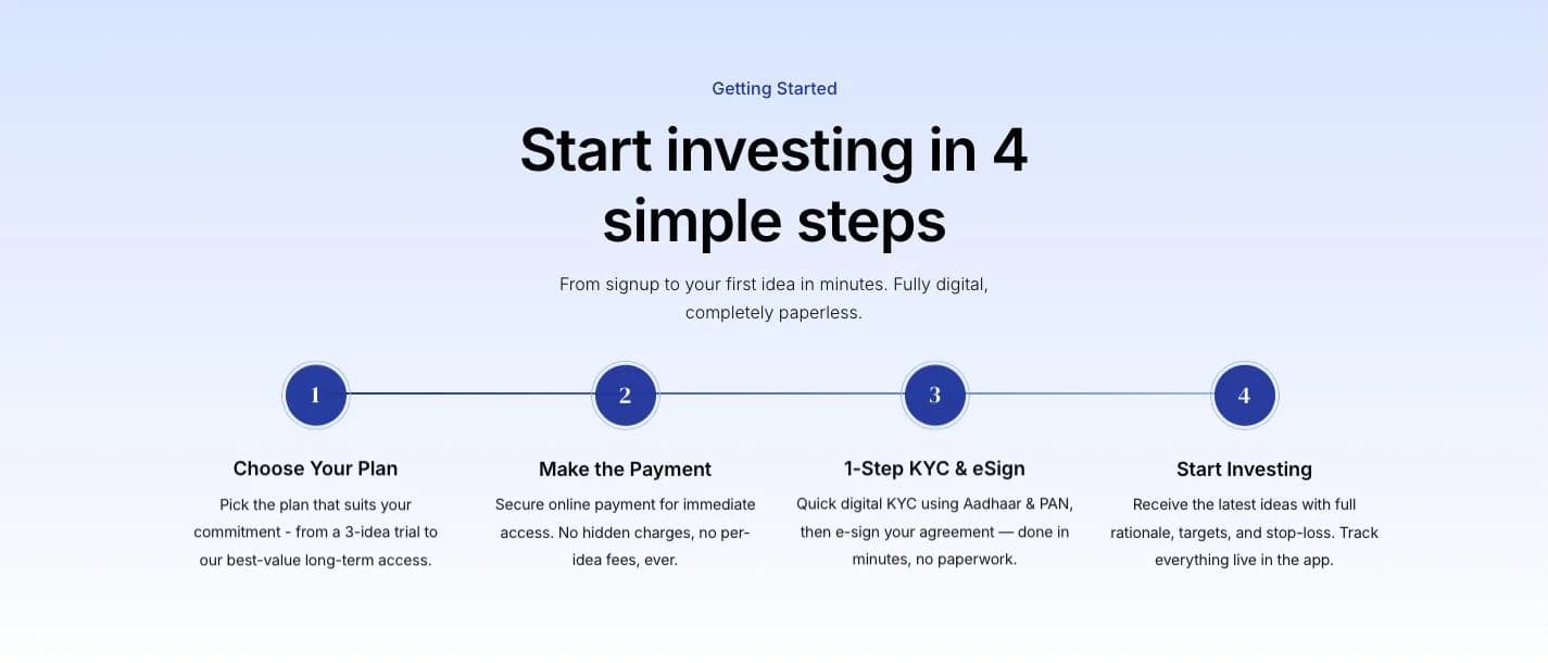
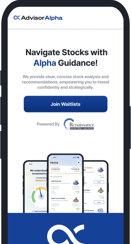
Twenty-page reports, readable with a thumb.
Long-form research broken into sections that are easy to scan, navigate and come back to on a phone.

Built to run itself. Made faster with AI.
- ✓Website designed in Figma and built on WordPress
- ✓Brand kit refined and extended into a UI kit
- ✓Content and blog CMS set up, so the team publishes on its own
- ✓Plugins for emailers, messages and enquiry forms
Sophisticated research doesn’t have to intimidate.
Dense information, paired with a clean and premium reading experience. Advisor Alpha now has a site that helps investors approach their portfolios with confidence rather than anxiety.